
The Glass Ceiling of macOS Icon Design
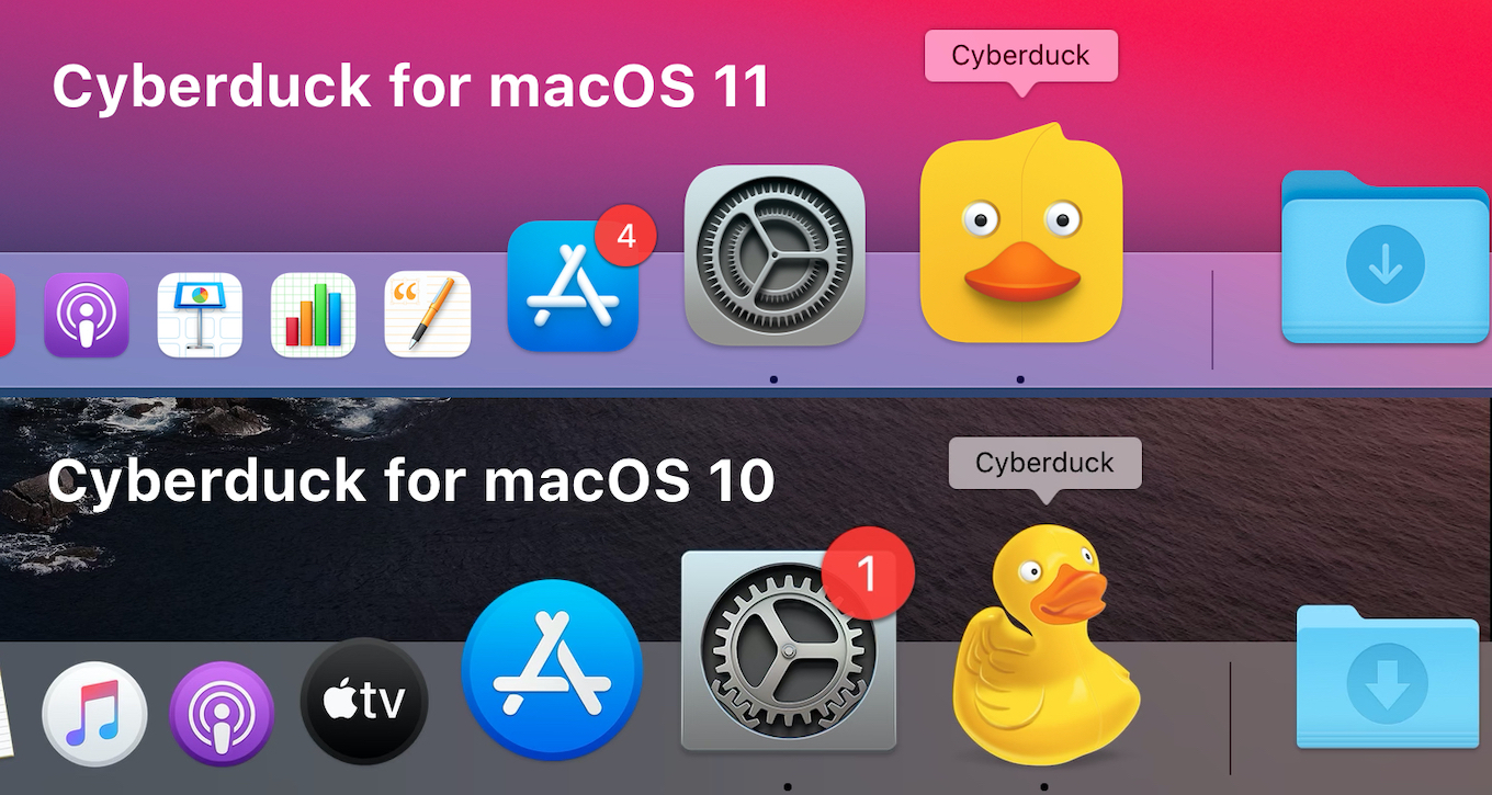
Remember the days when you'd glance down at your dock in macOS and see a duck-shaped icon, perched next to a green circle, which was hanging out next to a fun 3D truck?
I'm talking about Cyberduck, Spotify and Transmit 5.
Three of the most striking, beautiful, joy-bringing app icons available to all Mac users.
 (Credit: https://applech2.com/)
Well. Those days are over, my friend.
As of macOS Sequoia and in preparation for macOS Tahoe, your dock is about to become less fun, less original, and less joyous.
Glory to the Squircle.
Apple has gradually been tightening the rules around macOS icons. With the arrival of Big Sur, the “squircle” became the standard shape. By Sequoia, it’s no longer a gentle nudge — it’s the default, and anything else looks out of place on the Dock.
And believe me. You do NOT want to look out of place on the Dock.
The intention is clear: consistency. Icons should look cohesive when lined up in the dock, rather than a jumble of circles, trucks, and cartoon quackers. Apple has always cared about this level of detail, but the latest design language leaves far less room for individuality. It's a shame.
Remember skeuomorphism? That was, in my opinion, the peak of app icon design. Was it impossible for the average developer to make something half decent on Photoshop? Yes. Did it create some of the most beautiful icons ever on the Mac and iOS? Oh, absolutely.
Striking a Balance
For DB Pro, we of course want to fit in and be good macOS citizens, abiding by the Apple Design Guidelines. However, we think there's a compromise.
Building DB Pro, the best DB workspace app around, we felt like this was an amazing opportunity to hark back to the good ole' days of skeuomorphism and make an app icon that looked, felt, and smelt like a database.
After all, databases are sort of squircle-shaped, aren’t they?
So, we downloaded Apple Icon Composer and got to work.
To be fair, Icon Composer does some heavy lifting and magic-making. You drop in your app icon, and it'll add some really nice glass effects to the edges. You can even change the direction of the light.
So we designed our icon to respect Apple’s modern requirements while still carrying a bit of personality. It’s recognisably “Mac-like,” but it’s also unmistakably DB Pro. A little nostalgia, a little rebellion, and just enough glass to keep Cupertino happy.
Beyond the Glass
The macOS icon system isn’t going to roll back — the squircle and the glass aesthetic are here to stay. But that doesn’t mean personality has to vanish completely.
For developers, the challenge is finding ways to work within Apple’s constraints while still keeping a sense of identity. For users, it’s about appreciating the small design decisions that make an app feel human, even if it lives behind a pane of frosted glass.
At DB Pro, we’ve chosen to play by the rules, but bend them just enough to keep things interesting. Because icons should do more than sit neatly in a row — they should make you want to click them.